Task Oriented User Flow
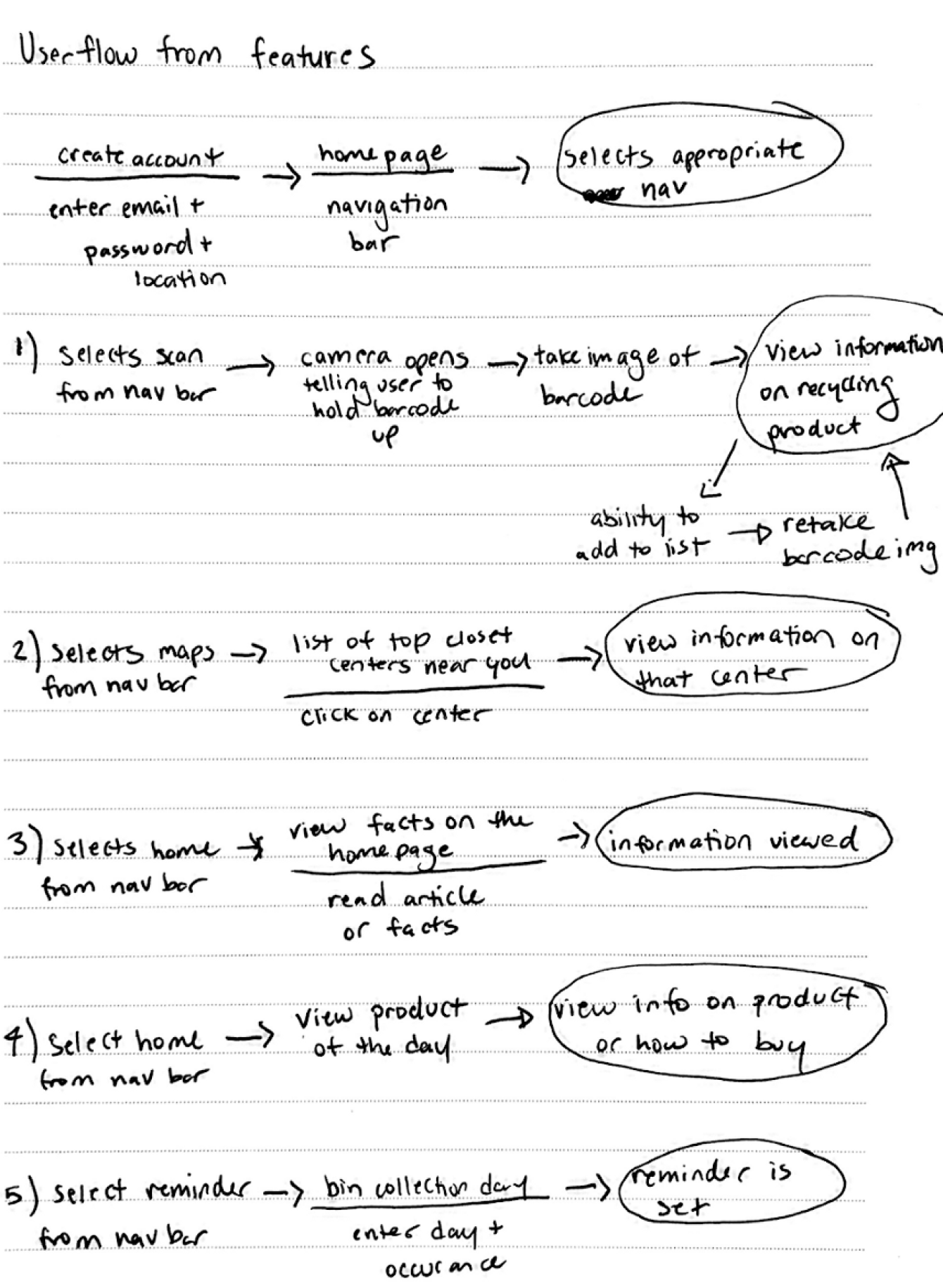
Using the main features and user stories, I created a user flow which mapped out the paths for each task I wanted each of the users in the stories to complete.

Streamlining the recycling experience
Role
Research, Ideation, Visuals, Prototyping
Tools Used
Figma, Illustrator
Type
Mobile App Prototype
Date Completed
May 2021
We’re all used to recycling plastic water bottles, cans, paper, etc… but what about the thousands of other objects that can be recycled? According to RecyclingToday, statistics show that almost half of Americans feel that recycling is difficult and 73% would say that they would like to become more knowledgeable about it. This shows the importance of educating Americans on recycling but also making it easy and accessible.
Everybody wants to try their best to recycle and save the environment but sometimes there are just items you don’t know what to do with and it just seems like a hassle to make multiple google searches for something so simple. Having an all in one environmentally friendly app that can help improve this lifestyle was what I set out to do. Recycling is now just one or two clicks away and will tell you exactly what you need to know about what you want to recycle.
My need-finding process was based primarily on interviews with multiple friends and research on how Americans overall feel about recycling and their current habits. The interviews mostly all came to the conclusion which was that recycling was not fully understood as well as that they would like to learn more about it. From this, I was able to formulate two UX personas and their goals in order to create a problem for my product to effectively solve/address.
UX Persona: Primary Target
UX Persona: Secondary Target
As a user I want to …
Using the main features and user stories, I created a user flow which mapped out the paths for each task I wanted each of the users in the stories to complete.

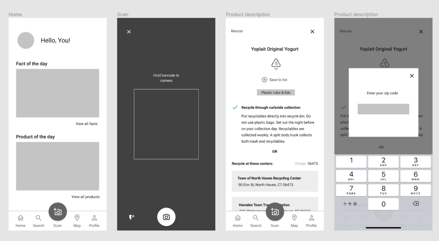
My first go with turning these ideas into an actual design started with an outline that followed the user stories and tasks. Starting with a low fidelity prototype allowed me to focus on more user experience functionality rather than having to tackle both that and design at the same time. I found that I made many changes from my low fidelity prototype to my first draft of a high fidelity prototype. This prototype mainly just mapped out the features and placement of items to get a feel of its usability.


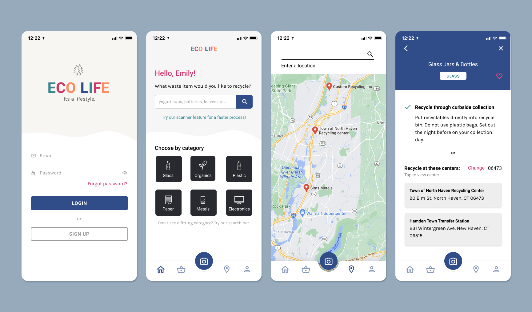
After forming a style tile for my product, I was able to easily integreate it into my low fidelity prototype with a few draft fixes before the final. I followed Jakob Nielsen's 10 general principles for interaction design in order to create a product that values user experience and their interactions.